Our content is reader supported, which means when you buy from links you click on, we may earn a commission.
10 Reasons Why Minimalist Website Design and Lead Generation Are a Perfect Match

Simple websites often get more sales.
Fancy websites can look amazing, but they don’t always drive more conversions. And in the world of digital marketing, conversions are key.
Some of the biggest metrics in digital marketing deal with lead generation. These new leads you generate are added to your email list.
You want to get high-quality leads who will convert into buyers later on. And you want to get them in the most effective way possible.
Having too much on any page, let alone an opt-in page where you’re trying to generate leads might just cause your qualified leads to leave.
Simplifying your design and choosing a single call to action can increase conversions by as much as 30 to 40%.
Plus, simple websites load more quickly and communicate ideas more effectively to each potential customer.
That’s why most businesses interested in lead generation find themselves switching to minimalist designs. Clean and clutter-free pages don’t just look good; they often lead to better results.
1. Consistent Content Is Approachable
People like to engage with things they already understand. If you present them with a new layout, they’ll have to think for a few seconds or maybe even minutes before they can engage with any piece of content on the page.
One of the significant benefits of minimalist content is visual consistency. Once you’ve seen the first page on a minimalist website, you’ve seen them all – and this makes it easy for your audience to find their way around.
The CXL.com blog is an excellent example of a consistent minimal design.
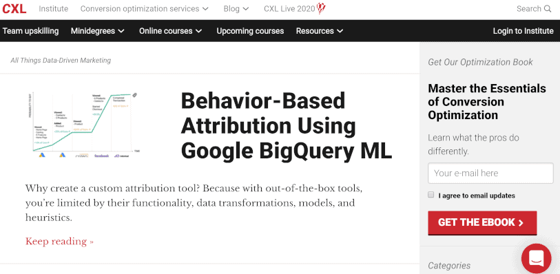
CXL.com has a standard color scheme of red and black. Notice the large, clear heading font and the simple sidebar that calls attention to the opt-in. Every page on their blog, in addition to the entire site, has the same consistency.
Viewers also appreciate consistency between multiple websites in the same category. Even if different companies run two eCommerce websites, they’ll both be more successful if they follow a similar pattern for their designs.
When you’re designing a landing page for lead generation efforts, try to remain consistent with websites similar to your own.
Modern users expect to find navigation buttons at the top of the page, content in the middle, and a call to action down at the bottom. These best practices work well on mobile devices and can quickly adapt to any content.
2. Help Funnel Your Visitors
Make sure your lead generation page only serves one purpose and that purpose is to generate leads. This is about as minimal as you can get. You want people who come to that web page to enter their contact information and click the button that opts them in.
And that’s it.
You don’t want them looking around for blog posts, your extensive content marketing campaigns, or even products at that point. You want that page to cater only to your lead generation strategy which is to collect email addresses to add to your sales funnel.
So keep your lead pages as bare minimum as possible. These are a part of your marketing funnel. They don’t need anything fancy added to them, just the minimal amount to get your target audience to opt-in.
3. Concise Text is More Consumable
The headline and any other text on your lead generation pages must be easy to understand.
And fortunately, minimal headlines and copy are much easier to understand and more likely to be read then scrolling pages.
Spending the time to distill whatever you’re offering down to a bare minimum will pay off. Short, 5 to 7 word headlines are perfect.
You want quality leads so promise your web visitors something meaningful to them.
Think about the type of lead magnet they will value. The format isn’t as important as the value, but a few ideas you can choose from include a white paper, e-book, mini-course, and free trials.
You need to create a free resource that is seen as an irresistible offer (especially considering they just need to trade their email address to get it). And then convey all the valuable content they get with as little text as possible. Focus on the unique needs of your prospective customer and the high value you provide.
The headline is the top of the funnel so you need to spend time on it. Keep in mind that less is definitely better.
4. Simple Forms Equal More Opt-Ins
The less personal information you ask for from your prospective customers, the more likely they are to fill out your forms.
If you’re giving them a free email newsletter then you don’t need their address or even a last name. Honestly, you can get by without a first name too. You really just need that email address. So consider what you need and then only ask for that.
And if you’re going to go out of the way to design your lead generation opt-ins, pop-ups, and pages in a minimal way, then the forms need to fit the design.
Some lead generation tools just don’t have nice looking, minimal forms which is a shame. Professional email marketing tools do a great job with lead management and sending follow-up emails, but very few handle the forms properly.
ConvertKit offers nice forms you can embed on your web page. The form can be embedded with no other text or graphics so you may just copy and paste the code into a page that you’ve designed.
Otherwise, you might need to use a tool like Zapier to connect your email solution with a form you or your web designer have created.
The form is the very start of the lead generation process so it needs to fit your minimalist design.
5. Mobile-Friendly Designs are Streamlined
Minimal designs are typically mobile-friendly which is great for user experience as well as your conversion rates.
According to the World Advertising Research Center (WARC), about 2 billion people only access the internet through their smartphones. And the number is growing.
So a large volume of your web visitors use mobile devices. You want to make sure you can generate leads from them as well.
It’s important to ensure your designs are mobile responsive and minimalist designs are definitely on the right path. These designs are often simple and will display great on mobile.
Use the Mobile-Friendly Test to see how your pages stack up and review them on your own mobile device as well.
6. Buttons Are Instantly Recognizable
If your target market can’t move forward they won’t convert. Buttons are a particularly easy place for visitors to get caught up; if they don’t know it’s a button, they won’t click on it.
Here’s an example from the Ahrefs.com site that is unmistakably a button:
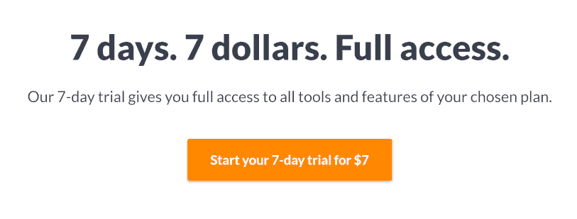
The contrast between the orange and the white background makes the button jump off the page. Ahrefs.com maintains consistency by using the same button scheme throughout their site.
Buttons are essential enough to have their own HTML tag. If you use a button instead of a link, you’ll have more style options that help it stand out from the page. Buttons are also great for screen readers and alternate browsing methods.
Of course, creating a heavily-designed button won’t always result in conversions. A true minimalist design includes a simple button that looks clickable without detracting from the rest of the page. Try using a touch of shading or a clean border, and always make sure that the text is easy to read.
If you design your button successfully, you’ll have a clickable flash of color that jumps off the page. Make sure it’s the only obvious thing to click and watch your conversion rate instantly increase.
7. Opting In Should Be Easy
A nice button isn’t the only way to introduce a call to action, but it meets the main qualification of lead generation design: making it easy to opt-in.
The goal of lead generation is to guide the client from your initial hook (which is your headline) down to the end of the page. If you’ve successfully made your pitch, they will follow whatever opt-in strategy you’ve provided, whether it be filling out a form, entering their email, or simply opening a chat window.
Minimalist designs are a great way to create a natural flow across your page. When you cut the clutter and use simple design elements, your viewers automatically know where to look and when to keep scrolling.
When a viewer finally reaches the call to action, they should know the type of action you want them to take. Use simple phrases like “subscribe,” “contact,” or “try now” to communicate your message.
Pair your compelling text with an eye-catching design that stands out from the page. Use minimalist design principles to keep it approachable – you want your leads to feel comfortable during every step of the process.
8. Minimalist Designs Stand Out
In a world full of flashing banner ads and busy news feeds, the most straightforward designs are often the most appealing. Complicated designs consistently rated as less attractive than those with primary, standardized website elements. It almost seems like a paradox to “stand out” by simplifying, but the principle makes more sense than you think. Imagine walking down the cereal aisle in the grocery store. All the boxes are colorful, so it’s hard to notice any of them. But if one of those boxes had no color at all, you’d probably see it right away.
One of the essential features of a simple design is a white background. White backgrounds are more natural for your brain to process because they let you focus on the content without trying to process busy colors or images.
That doesn’t mean you should skip the color entirely. Color is incredibly crucial for lead generation, but use it with care. Your eyes will automatically jump to the most exciting thing on the page. In most cases, that should be an essential header or a call to action. You can also use colorful images to help communicate your message.
Here on the CXL.com homepage, you can see the use of a white background along with the call to actions in color:

It’s very minimal but leads your eye and, hopefully, your mouse to the exact place the company wants you to go.
Here you’re faced with a decision; either you want to get the skills or have them do it for you. The use of color and minimal design makes the decision obvious right on the website homepage.
In general, the goal of a simplified design is to highlight essential elements while letting others drift into the background. Don’t fall for the trick of thinking that everything is essential. Decide on one or two elements you want customers to notice and make those the focus of your design.
9. Simple Pages Load Faster
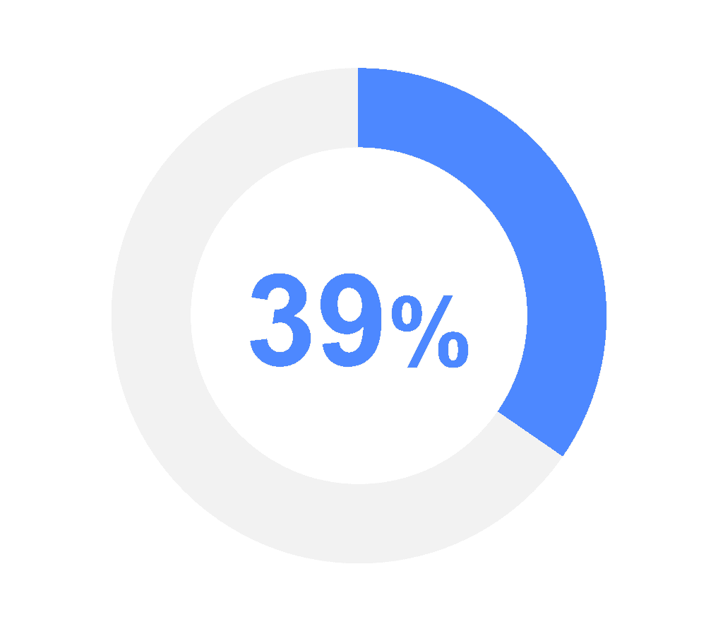
39% of users admit that they’ll stop using a site if the page won’t load fast enough.
Adding a single second of loading time can drop your conversion by as much as 27%, and having broken elements will kill your sales faster than anything else. In the world of lead generation, there’s no time for slow and bulky designs. Your landing page needs to load quickly and be easy to use. Luckily, minimalist design features naturally lead to lightweight pages that don’t put a lot of strain on your browser.
If you’re worried about loading times, start by reducing the number of images on your page. You should also cut any complicated style features that take a few minutes for your browser to figure out. Flash animations, plugins, social media stats, and large files are all serious loading time culprits.
A good rule for creating a minimalist page is to limit yourself to one of each thing. Have one header, one text block, one image, and one video. Finish it all off with one stellar call to action. When there are fewer elements on the page, your loading times and conversions both skyrocket.
And don’t forget to test your page on multiple different browsers. A site that loads quickly on your computer might not load so easily on a mobile device.
Mobile devices are currently one of the most popular internet browsing methods and generate about half of all website traffic. If you fail to confirm your browser compatibility, you could lose a significant amount of sales.
10. Clutter-Free Content Is Easy to Read
Every great minimalist design frees you to accomplish your goals for the specific page. Without bright images and loud fonts, there’s nothing to distract from the clear and straightforward content that you’ve laid out.
Here’s a great example from Getresponse.com:
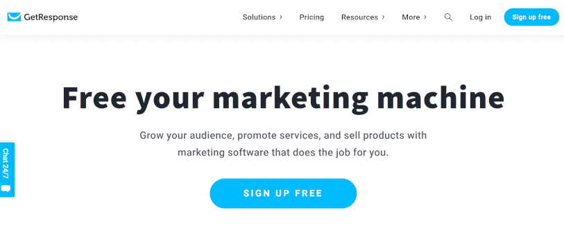
Notice there’s nothing really for a visitor to do other than take in the headline, maybe the subheading, and then click on the “sign up free” or “free trial” button.
It’s all designed this way because that’s what Getresponse.com wants its visitors to do. They’ve put that front and center-right on the homepage.
An essential part of lead generation is making sure that the viewer interacts with your pitch. You want them to read your copy and take in the information you’re trying to provide.
Conclusion
The best lead generation pages tell the customer everything they need to know about your company.
Don’t clutter the page with too much text. Lay down the necessary bullets, and trust your visitors to keep reading if they want more information.
If you’re trying to generate leads, you need a minimalist design that makes an impact. Simple elements and short loading times are essential, but they won’t work unless your design has an extra bit of punch.
That’s why the best minimalist designers know how to balance compelling visuals with soothing backgrounds to create the perfect landing page every time.