Our content is reader supported, which means when you buy from links you click on, we may earn a commission.
Using C.R.A.P Design in Your eLearning Training

The name might be a bit off-putting, but designs that follow C.R.A.P. principles are anything but.
This design philosophy appeals to the user’s inherent expectations for how a page or a website should work.
By following normally accepted standards for color use and page layout, you help can guarantee that your students will be able to interpret and digest the information in your class.
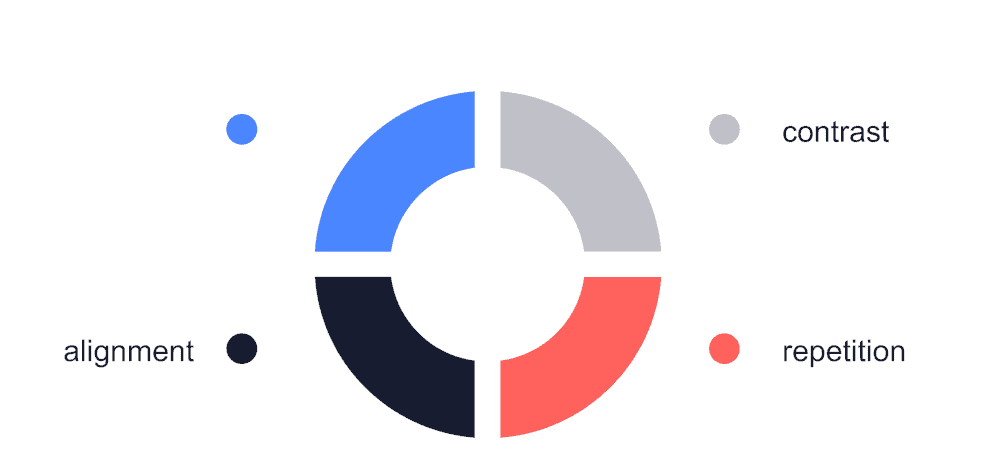
What Does C.R.A.P. Stand For?
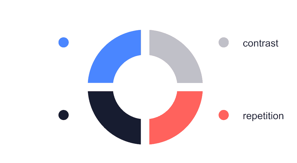
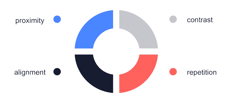
In the world of visual design, C.R.A.P. stands for contrast, repetition, alignment, and proximity.

Although the acronym was first presented by author and designer Robin Patricia Williams in “The Non-Designer’s Design Book,” these design principles are apparent in great pieces of art throughout the centuries.
The principles behind C.R.A.P. design stem from commonly-accepted rules for the use of color, light, line, and layout. Every beautiful painting or photograph includes proper contrasting. Repetition and proximity organize nearly every document in existence.
The current understanding of alignment was modernized for the digital era, but it still uses the rule of thirds. The rule of thirds originated during the Rennaisance.
An understanding of C.R.A.P. can’t replace years of art or design school, but it can’t definitely improve the visual appearance of your online classes. Your students will also appreciate how much each of these principles contributes to their learning experience.
Contrast: Creating Visual Distinction
One of the most important aspects of any effective visual design is contrast. Contrast places emphasis on some visual elements while letting others fade into the background. This lets you distinguish between multiple elements and makes it easy for your eye to find the focal point in the center of the page.
 Use of White Space
Look at any nearby book to find one of the best examples of effective contrast.
Flip open the cover, and take a look at the way the black text sits on the plain white background. The text stands out perfectly, and the paper itself doesn’t take up any of your attention; it’s there to support, not to stand out.
In the same way, the body text of a web page is usually a color that contrasts with the background, making the text easy to read. Similarly, a great web page creates visual contrast with white space and carefully-planned color schemes.
Black and white aren’t your only options; you can use any dark or light shades to get this visual effect.
Use of Colors
You can also create high contrast by using hues from different sides of the color wheel, as long as everything fits within the same color palette.
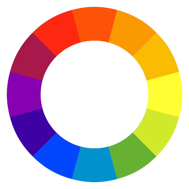
Vary the saturation of your colors; if you use the same saturation for every aspect, your image will become low contrast when converted to greyscale.
Visual Weight
Another way to create contrast is through visual weight. Your eye will naturally be drawn to the part of the page with the busiest or “heaviest” design. This means you can use bold text, borders, and bright images to direct user attention towards the most important piece of information on a page or slide.
Less important items should be designed to have a correspondingly lighter visual weight, either by making them different sizes or by changing another aspect of the design.
Good use of contrast is one of the hallmarks of great design, but remember not to overdo it. The most important pieces of information should contrast with the rest of the page. If everything contrasts, nothing will feel like it fits together.
Repetition: Creating Consistency and Familiarity
Humans learn by repetition. When we encounter new information, we often look for similarities with other things we have encountered. If there are similarities, we are able to focus on the unique content without wasting time re-learning the old. User experience designers create user interfaces that are easy to learn and navigate using this educational principle.
When it comes to designing an online course, repetition can be the lifeline that your students use to make sense of the information you’re presenting.
One simple example of repetition is using the same font for every headline. When students see that font, they know a new section is about to start.
You can harness a similar effect in an eLearning environment by using the same layout for every slide or by presenting similar information in a consistent fashion throughout your class.
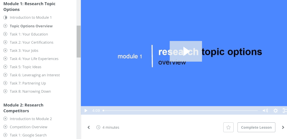
In the example above, every screen has the navigation in the same place as well as the same video position and buttons.
Repetition is often most effective when used with colors. For most designs, you should have a color palette that includes three to five different hues. Whenever you need to choose a background or text color, select the most appropriate choice from this palette.
Remember to make choices that create a good sense of contrast. You may want to test multiple colors from your palette to see which one looks best.
Alignment: Creating a Visual Flow
All modern websites utilize the invisible grid. This grid stretches across your monitor or the screen of your cell phone. This grid helps orient images, headlines, and blocks of text. When you load a web page, your browser uses this grid to determine how the page should display.
Readers and users prefer when items are properly aligned on this grid. A header needs to align with the text underneath it, just as an image needs to align with the navigation bar across the top of the page.
Good alignment creates a sense of visual cohesion, while poor alignment will often discourage users from interacting with your design.
Grids are used for nearly all digital design programs, including those intended for videos are presentations. Some programs let you display grid lines, while others force images to “snap to grid” when you drag them across the page.
Use these tools to make sure your items line up as perfectly as possible. If something is even a few pixels off-center, you can guarantee that one of your students will eventually notice.
Even if you don’t have a grid, you can usually check the alignment of a page using visual intuition. Well-aligned items just look “right.” Poorly aligned items look tilted, askew, or “wrong.” Don’t be afraid to nudge things back and forth by a few pixels – some fonts and styles don’t display like you expect them to.
Proximity: Creating a Connection
The proximity design principle is the idea that if two items are close together, your mind will naturally assume they are related. Text placed directly below an image looks like a caption. When buttons are placed together, users often assume that the links are in the same category.
Creating clusters of like objects is a fairly standard part of user experience design. Links related to a similar topic should go under the same headline, and images go next to the text they represent. Designing in this way should feel organized and natural; if something doesn’t belong, you may need to create a new section.
As a course designer, you should also be aware that unintentional proximity can create false connections. If you end one section with an image and jump straight into the next section, your users might not be able to decide which block of text the image was meant to represent. This is why it’s important to use plenty of white space to visually break up your design.
Putting It All Together
C.R.A.P. design principles are meant to inform nearly every aspect of the design process. When building your online class, run through the C.R.A.P. checklist to make sure you’re on track.
- Contrast: Is your text easy to read? Do important items have more visual weight? Does your page look good in both color and greyscale?
- Repetition: What are the visual “rules” that users can rely on to understand your design? Do your headlines follow a consistent font structure? Are links typically located in the same place?
- Alignment: Does your design make effective use of the grid structure? Do any of your visual elements appear to be floating out of place?
- Proximity: What does the placement of each element say about the items around it? Images, videos, and text need to be placed effectively in relation to each other.
These principles contribute to the cohesive appearance of your document. Once you’ve decided how to use contrast, remember to repeat that style throughout your class. Align media items along the same virtual axis, and use proximity to draw a visual connection between related pieces of information.
Once you’ve considered each item individually, take a look at your design as one visual piece. If you’ve followed the principles, everything should feel like it “blends together” on the page. When something stands out awkwardly, it’s probably violating one of these rules.
If you plan on releasing multiple lessons or multiple related online classes, you should definitely create a template using C.R.A.P. principles.
That way, you’ll only have to go through the design process the first time. This is just one shortcut involved with rapid eLearning where you strive to create a course in weeks vs months. Just remember that even the best template may require small adjustments – never assume that a layout is perfect until you step back to take an objective look.
Frequently Asked Questions About CRAP Design
What are the different types of design principles?
Design principles are rules for designing websites, apps, and other digital experiences.
There are two main categories of design principles: visual design principles and interaction design principles. Visual design principles include things like color theory, typography, grid systems, and layout. Interaction design principles focus on how users interact with interfaces.
What is proximity in crap design?
Proximity is when two elements are close together. This means they are visually related. The closer the elements are, the stronger the relationship between them. If you want to create a strong visual connection between two objects, place one object next to another.
Which crap principle makes distinct elements stand out in the design?
The best way to create a distinctive element is to use different colors for each design element. This creates a visual hierarchy that helps users understand what they should click next.
What do the R and P stand for in the crap design principles?
The R stands for “reduce,” while the P stands for “prioritize.” These two words are used to describe how to create a better design. Reducing clutter and prioritizing what matters most are key concepts when designing a new website.
Why is it important to know the principles of design?
Design is one of the most important aspects of any website. If you don’t understand how to create a visually appealing website, then you won’t be able to attract visitors who want to stay on your site for longer periods of time. The best way to learn about design is through practice. Start small by designing a logo, or redesigning your current site.
What are the 4 basic principles of design?
The four basic principles of design include simplicity, clarity, consistency, and accessibility.
-
- Simplicity means having fewer elements and less clutter.
- Clarity refers to how easy it is for users to understand what they’re looking at.
- Consistency means having similar styles throughout your site.
- Accessibility means making sure all parts of your website work well for everyone.
Which is the most powerful design principle?
Design principles are rules for designing things like websites, apps, and other digital experiences. There are many different types of design principles, such as usability, accessibility, and performance. The best design principles are those that help us create better designs, faster, and at lower costs and can differ from each designer.
What are some benefits of using CRAP design in elearning?
CRAP design, or contrast, repetition, alignment, and proximity, is a common design principle that can be applied to many different areas, including elearning.
The idea behind CRAP is to use these four elements to create a visually appealing and easy-to-understand design. When used correctly, CRAP can help to make complex information more understandable and easily digestible.
Additionally, by using high contrast colors, repeating important elements, and aligning content in a logical way, designers can help to ensure that learners are able to focus on the most important parts of the elearning course. Ultimately, by using CRAP design principles, elearning designers can create more effective and engaging courses.
What are some tips to keep in mind when using CRAP design?
CRAP design is all about making your content more readable, visually appealing, and easy to digest. Here are a few tips to keep in mind when using CRAP design:
- Use contrast to make your text more readable. For example, use a dark font on a light background, or vice versa.
- Use alignment to organize your content and make it easier on the eye. For instance, you can align all of your text to the left, right, or center.
- Use repetition to create visual interest and rhythm. For example, you can repeat certain elements throughout your design, such as colors, shapes, or textures.
- Use proximity to group related elements together. This makes it easier for your audience to understand the relationships between different pieces of information.
Conclusion
Creating with CRAP design principles is surprisingly easy, especially with modern tools. Every eLearning software is different, but most programs allow you to dictate colors, fonts, and image placement.
Start by selecting a color palette that has room for both cohesion and contrast. Create rules of repetition to help guide students throughout your course. Then, arrange your page with both alignment and proximity at the top of your mind.
The best way to understand C.R.A.P. principles is to see them in action. The next time you’re creating a presentation for your online class, think about the way you’re using contrast, repetition, alignment, and proximity. If something doesn’t look right, try changing the color or placement. The results might surprise you!
